水平布局
许多类在使用配置对象创建(实例化)类时都有快捷名称。快捷名称被称为 别名(如果类扩展了 Ext.Component,则称为 xtype)。别名/xtype 列在适用类的类名旁边,供快速参考。
框架类或其成员可以指定为 private 或 protected。否则,类/成员为 public。Public、protected 和 private 是访问描述符,用于传达类或类成员应如何以及何时使用。
Public 类和类成员可供任何其他类或应用程序代码使用,并且可以在主要产品版本中作为稳定和持久的内容依赖。公共类和成员可以通过子类安全地扩展。
Protected 类成员是稳定的 public 成员,旨在由拥有类或其子类使用。受保护的成员可以通过子类安全地扩展。
Private 类和类成员在框架内部使用,不供应用程序开发人员使用。私有类和成员可能会随时更改或从框架中省略,恕不另行通知,并且不应在应用程序逻辑中依赖。
static 标签。*请参阅下面的静态。下面是一个示例类成员,我们可以对其进行剖析,以显示类成员的语法(在本例中,从 Ext.button.Button 类查看的 lookupComponent 方法)。
让我们看一下成员行的每个部分
lookupComponent)( item ))Ext.Component)。对于不返回除 undefined 以外的任何内容的方法,可以省略此项,或者可以显示为由正斜杠 / 分隔的多个可能值,表示返回的内容可能取决于方法调用的结果(即,如果 get 方法调用成功,则方法可能返回一个 Component,如果失败,则返回 false,这将显示为 Ext.Component/Boolean)。PROTECTED - 请参阅下面的标志部分)Ext.container.Container)。如果成员源自当前类,则源类将显示为蓝色链接;如果成员从祖先类或混合类继承,则显示为灰色。查看源代码)item : Object)。undefined,“返回”部分将注明返回的类或对象类型以及描述(示例中为 Ext.Component)自 3.4.0 版本起可用 - 示例中未显示),紧随成员描述之后默认为:false)API 文档使用许多标志来进一步传达类成员的功能和意图。标签可以用文本标签、缩写或图标表示。
classInstance.method1().method2().etc();false,则标记为可阻止的事件将不会触发- 表示框架类
- Singleton 框架类。*有关更多信息,请参阅 singleton 标志
- 组件类型的框架类(Ext JS 框架中扩展 Ext.Component 的任何类)
- 表示类、成员或指南在当前查看的版本中是新的
- 表示类型为 config 的类成员
- 表示类型为 property 的类成员
- 表示类型为 method 的类成员
- 表示类型为 event 的类成员
- 表示类型为 theme variable 的类成员
- 表示类型为 theme mixin 的类成员
- 表示类、成员或指南在当前查看的版本中是新的
在 API 文档页面的类名正下方是一行按钮,对应于当前类拥有的成员类型。每个按钮显示按类型划分的成员计数(此计数会随着过滤器的应用而更新)。单击按钮将导航到该成员部分。将鼠标悬停在成员类型按钮上将显示该类型的所有成员的弹出菜单,以便快速导航。
与类 config 选项相关的 Getter 和 setter 方法将显示在方法部分以及 API 文档和成员类型菜单的 config 部分中,就在它们所适用的 config 下方。getter 和 setter 方法文档将在 config 行中找到,以便于参考。
您的页面历史记录保存在本地存储中,并显示在顶部标题栏正下方(使用可用的实际空间)。默认情况下,仅显示的搜索结果是与您当前查看的产品/版本匹配的页面。您可以通过单击历史记录栏右侧的 按钮并选择“全部”单选按钮来展开显示的内容。这将显示历史记录栏中所有产品/版本的所有最近页面。
在历史记录配置菜单中,您还将看到最近页面访问的列表。结果按“当前产品/版本”和“全部”单选按钮进行过滤。单击 按钮将清除历史记录栏以及本地存储中保存的历史记录。
如果在历史记录配置菜单中选择“全部”,则将启用“在历史记录栏中显示产品详细信息”复选框选项。选中后,每个历史页面的产品/版本将与历史记录栏中的页面名称一起显示。将光标悬停在历史记录栏中的页面名称上也会将产品/版本显示为工具提示。
可以使用页面顶部的搜索字段搜索 API 文档和指南。
在 API 文档页面上,还有一个过滤器输入字段,可使用过滤器字符串过滤成员行。除了按字符串过滤之外,您还可以按访问级别、继承和只读来过滤类成员。这可以使用页面顶部的复选框来完成。
API 类导航树底部的复选框会过滤类列表以包含或排除私有类。
单击空的搜索字段将显示您最近 10 次搜索,以便快速导航。
每个 API 文档页面(Javascript 原始页面除外)都有一个与该类相关的元数据菜单视图。此元数据视图将具有以下一项或多项
Ext.button.Button 类具有 Ext.Button 的备用类名)。备用类名通常为了向后兼容性而维护。可运行的示例 (Fiddles) 默认在页面上展开。您可以使用代码块左上角的箭头单独折叠和展开示例代码块。您还可以使用页面右上角的切换按钮切换所有示例的折叠状态。切换所有状态将在页面加载之间记住。
类成员默认在页面上折叠。您可以使用成员行左侧的箭头图标或全局使用右上角的展开/折叠所有切换按钮来展开和折叠成员。
在较窄的屏幕或浏览器上查看文档将导致针对较小外形尺寸优化的视图。桌面视图和“移动”视图之间的主要区别在于
可以通过单击 API 文档页面顶部的类名来查看类源代码。可以通过单击成员行右侧的“查看源代码”链接来查看类成员的源代码。
一个布局容器,用于在一行中布局其子项。
重要的是要注意容器必须给定大小才能正常工作。
HorizontalLayoutContainer 来给定大小,例如使用 hlc.setPixelSize(600, 600);HorizontalLayoutContainer 给定大小。为子项提供大小。
HorizontalLayoutData 方法签名
new HorizontalLayoutData(double width, double height);
带有边距的 HorizontalLayoutData 方法签名
  new HorizontalLayoutData(double width, double height,
      new Margins(int top, int right, int bottom, int left));
布局采用其拥有的可用空间,减去所有固定像素大小和 -1 部件大小,然后按百分比划分其余部分。如果参数是双精度值,则它将是一个百分比。如果它大于 1,则表示为像素。
0.0 到 1.0 定义百分比的大小。或 0% 到 100%。
  new HorizontalLayoutData(.5, .75) // .5 == 50%, .75 == 75%
  new HorizontalLayoutData(.3, 1) // .3 == 30%, 1 == 100%
> 1 将大小定义为像素。
new HorizontalLayoutData(100, 200) // 100px by 200px
-1 将不调整子项的大小,将使用其自然大小。请参阅备选容器。
new HorizontalLayoutData(1, -1) // sets the height to -1
当期望调整子项的大小时,最好记录一些关于子项如何获得大小的注意事项。
如果 HorizontalLayoutContainer 具有另一个 VerticalLayoutContainer 或 HorizontalLayoutContainer 作为子项,则它将需要指定大小。它可以由父项或部件本身给定。
好的示例
  hlc.add(vlc, new HorizontalLayoutData(1, .50)); // 100% width x 50% height

  hlc.add(vlc, new HorizontalLayoutData(1, 1)); // 100% width x 50% height

  hlc.add(vlc, new HorizontalLayoutData(100, 100)); // 100px width x 100px height

  VerticalLayoutContainer vlc = new VerticalLayoutContainer();
  vlc.setPixelSize(100, 100); // 100px width x 100px height
  hlc.add(vlc); // -1 HorizontalLayoutData would be -1 width x -1 height

  VerticalLayoutContainer vlc = new VerticalLayoutContainer();
  vlc.setPixelSize(100, 100);
  hlc.add(vlc);
不良示例:(请参阅备选容器。)
  VerticalLayoutContainer vlc = new VerticalLayoutContainer();
  // vlc needs > vlc.setPixelSize(100, 100);
  hlc.add(vlc, new HorizontalLayoutData(1, -1)); // 100% width x -1

  VerticalLayoutContainer vlc = new VerticalLayoutContainer();
  // vlc needs > vlc.setPixelSize(100, 100);
  hlc.add(vlc));  // -1 width x -1 height
当对所有子布局数据使用 -1 或像素值时。如果您对除一个以外的所有项都使用 -1,而最后一个项获得 1.0,则这是 HorizontalLayoutContainer 的完美用例。当使用 -1 时,还有一些其他容器选项可能更适合设计。
使用 ScrollSupport 激活滚动。
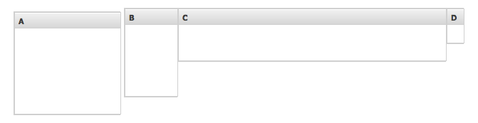
使用 com.sencha.gxt.widget.core.client.container.HorizontalLayoutContainer 部件的示例,结果类似于屏幕截图
  import com.google.gwt.user.client.ui.IsWidget;
  import com.google.gwt.user.client.ui.Widget;
  import com.sencha.gxt.core.client.util.Margins;
  import com.sencha.gxt.widget.core.client.ContentPanel;
  import com.sencha.gxt.widget.core.client.container.HorizontalLayoutContainer;
  import com.sencha.gxt.widget.core.client.container.HorizontalLayoutContainer.HorizontalLayoutData;

  public class HlcExample implements IsWidget {
    private HorizontalLayoutContainer hlc;

    @Override
    public Widget asWidget() {
      if (hlc == null) {
        // The HLC will size this, 150px width x 150px height
        ContentPanel cpA = new ContentPanel();
        cpA.setBorders(true);
        cpA.setHeading("A");

        // The HLC will size this, 75px width x 125px height
        ContentPanel cpB = new ContentPanel();
        cpB.setBorders(true);
        cpB.setHeading("B");

        // The HLC will size this, 100% width x 50% height
        ContentPanel cpC = new ContentPanel();
        cpC.setBorders(true);
        cpC.setHeading("C");

        // The HLC will *NOT* size this, -1 width x -1 height
        ContentPanel cpD = new ContentPanel();
        cpD.setBorders(true);
        cpD.setHeading("D");
        cpD.setPixelSize(25, 50);

        hlc = new HorizontalLayoutContainer();
        hlc.add(cpA, new HorizontalLayoutData(150, 150, new Margins(5, 5, 0, 0))); // 150px width x 150px height
        hlc.add(cpB, new HorizontalLayoutData(75, 125)); // 75px width x 125px height
        hlc.add(cpC, new HorizontalLayoutData(1, .50)); // 100% width x 50% height
        hlc.add(cpD); // -1 width x -1 height
      }
      return hlc;
    }
  }
在 UiBinder 中使用 HorizontalLayoutContainer 的示例。
UiBinder xmlns 导入是使用 com.sencha.gxt.widget.core.client.container.HorizontalLayoutContainer 容器所必需的
xmlns:container="urn:import:com.sencha.gxt.widget.core.client.container"
使用 HorizontalLayoutContainer 的示例,结果类似于屏幕截图
  <!DOCTYPE ui:UiBinder SYSTEM "http://dl.google.com/gwt/DTD/xhtml.ent">
  <ui:UiBinder xmlns:ui="urn:ui:com.google.gwt.uibinder"
      xmlns:g="urn:import:com.google.gwt.user.client.ui"
      xmlns:container="urn:import:com.sencha.gxt.widget.core.client.container"
      xmlns:core="urn:import:com.sencha.gxt.widget.core.client">

      <!-- No margins -->
      <ui:with type="com.sencha.gxt.core.client.util.Margins" field="margins">
          <ui:attributes top="0" right="0" bottom="0" left="0" />
      </ui:with>

      <!-- Top and Right margins 5px -->
      <ui:with type="com.sencha.gxt.core.client.util.Margins" field="marginsRL">
          <ui:attributes top="5" right="5" bottom="0" left="0" />
      </ui:with>

       <!-- HLC LayoutData for container A -->
      <ui:with
          type="com.sencha.gxt.widget.core.client.container.HorizontalLayoutContainer.HorizontalLayoutData"
          field="hlcLayoutDataA">
          <!-- 150px width x 150px height AND top 5px margin, right 5px margin-->
          <ui:attributes width="150" height="150" margins="{marginsRL}" />
      </ui:with>

      <!-- HLC LayoutData for container B -->
      <ui:with
          type="com.sencha.gxt.widget.core.client.container.HorizontalLayoutContainer.HorizontalLayoutData"
          field="hlcLayoutDataB">
          <!-- 75px width x 125px height -->
          <ui:attributes width="75" height="125" margins="{margins}" />
      </ui:with>

      <!-- HLC LayoutData for container C -->
      <ui:with
          type="com.sencha.gxt.widget.core.client.container.HorizontalLayoutContainer.HorizontalLayoutData"
          field="hlcLayoutDataC">
          <!-- 100% width x 50% height -->
          <ui:attributes width="1" height=".50" margins="{margins}" />
      </ui:with>

      <!-- HorizontalLayoutContainer -->
      <container:HorizontalLayoutContainer>
          <container:child layoutData="{hlcLayoutDataA}">
              <core:ContentPanel heading="A" />
          </container:child>
          <container:child layoutData="{hlcLayoutDataB}">
              <core:ContentPanel heading="B" />
          </container:child>
          <container:child layoutData="{hlcLayoutDataC}">
              <core:ContentPanel heading="C" />
          </container:child>
          <container:child>
              <core:ContentPanel heading="D" pixelSize="25,50" />
          </container:child>
      </container:HorizontalLayoutContainer>
  </ui:UiBinder>
将 HLC 与 UiBinder 一起使用并实现 IsWidget
  import com.google.gwt.core.client.GWT;
  import com.google.gwt.uibinder.client.UiBinder;
  import com.google.gwt.user.client.ui.IsWidget;
  import com.google.gwt.user.client.ui.Widget;
  import com.sencha.gxt.widget.core.client.container.HorizontalLayoutContainer;

  public class HlcExampleWithUiBinder implements IsWidget {
    private static HlcExampleWithUiBinderUiBinder uiBinder = GWT.create(HlcExampleWithUiBinderUiBinder.class);

    interface HlcExampleWithUiBinderUiBinder extends UiBinder<HorizontalLayoutContainer, HlcExampleWithUiBinder> {
    }

    private HorizontalLayoutContainer hlc;

    @Override
    public Widget asWidget() {
      if (hlc == null) {
        hlc = uiBinder.createAndBindUi(this);
      }
      return hlc;
    }
  }


 GXT | 使用条款
